I'm most proud of the special edition cover designs during my time as the Graphic Design Editor. As the sole artist and designer, I was tasked with conceptualizing and executing these covers myself.
Below, you'll find my favorite covers and pages from the print editions.
During my two-semester turn as Design Editor, I was listed among other key editors twice for SPJ San Diego Campus Media awards.
Feb. 2022, the Love & Sex issue
Prior to becoming the Graphic Design Editor, I was tasked with conceptualizing a cover that was attention grabbing for the February issue. Since this was for a print issue, I knew that the most important details needed to be above the fold, but still attention grabbing and recognizable.
This concept was incorporated into the managing editor's existing design concept for the final print edition.
This was the first print issue of the semester.
Feb. 2022, the Spring Sports issue
This hand-drawn, digitally illustrated cover was my first cover as the Design Editor. A full revamp of the recurring cover elements would happen later.
April 2022, the Pride issue
The Pride Edition, 2022. I wanted to achieve something that was reminiscent of the school's seasonal drag shows, which came before Pride month, from which we had several photos, featuring a central figure coming out/breaking out of a border, while featuring the bright lights contrasted with the dark background, much like the shows themselves.
March 2022, the March Madness issue
Although there are details about this now that I would change, this cover ended up propelling this issue into the paper's history, as it was one of the most picked-up issues on record. Even though it came a year before the Aztec's record-breaking March Madness run, it was one of the most enjoyable covers to design.
With the incredible action shots we had of the starting five players, I knew I wanted to give this a "larger than life" feeling, which is why the players are above and larger than the stadium. The walkway is also digitally created to lead the eyes up towards a gradient sunset which brightens the players, and the word 'madness' extends past the margins. The bold Bebas Neue font supports this as well.
(We consciously chose to forsake the anti-Oxford comma rule of AP style for clarity)
(Again) March 2022, the Native American Heritage issue
I wanted this cover to tell a story of its own, and feature individual students, making it feel like a truly relatable story where readers could make eye contact with the subjects and learn something about them. The colorful painted backdrop and gilded frames make it almost seem like an inverse museum piece, invoking art, history and culture. The symbols representing the backgrounds and personalities of each individual are tinted in traditional Kumeyaay flag colors and help break the students out of the boxes on the page.
August-September 2022, the Orientation issue
After hours of debate about what the title should be, this cover was designed entirely remotely, since the campus had chosen to go remote for the first two weeks of school due to the COVID-19 pandemic. Since this was the introduction of SDSU's largest freshman class in history, I knew this cover would need to be immediately attention-grabbing, unique and speak to the tastes of Gen Z.
This nostalgic cover manages to appeal to the 90's and 00's trends that were (are) overtaking the aesthetic world for an Instagram-savvy student who had the iPhone as a staple of childhood, while also sparking a recognition in older students or faculty who regularly interacting with this Windows UI. The icons are informative and introduce the sections, and beneath the fold includes an introduction to the paper as well as a welcoming message.
March 2022, the Women's History Month issue
I brainstormed this concept with the other female editors of the Daily Aztec, asking them what gendered challenges they felt as students and what would be an. empowering message without being aggressively tacky. Ultimately, there were so many great concepts and ideas that I couldn't include everything. This made me realize I wanted to design a cover that included lots of words and labels that often hold women back.
With the gradient of words against the gradient of the sky, I wanted to lead readers eyes down, piquing curiosity to look past the fold and end their eyes on the beautiful and recognizable skyline of downtown San Diego. This was intended to be inspiring, reminding readers that just past each of these borders they set for themselves lies a world of opportunity.
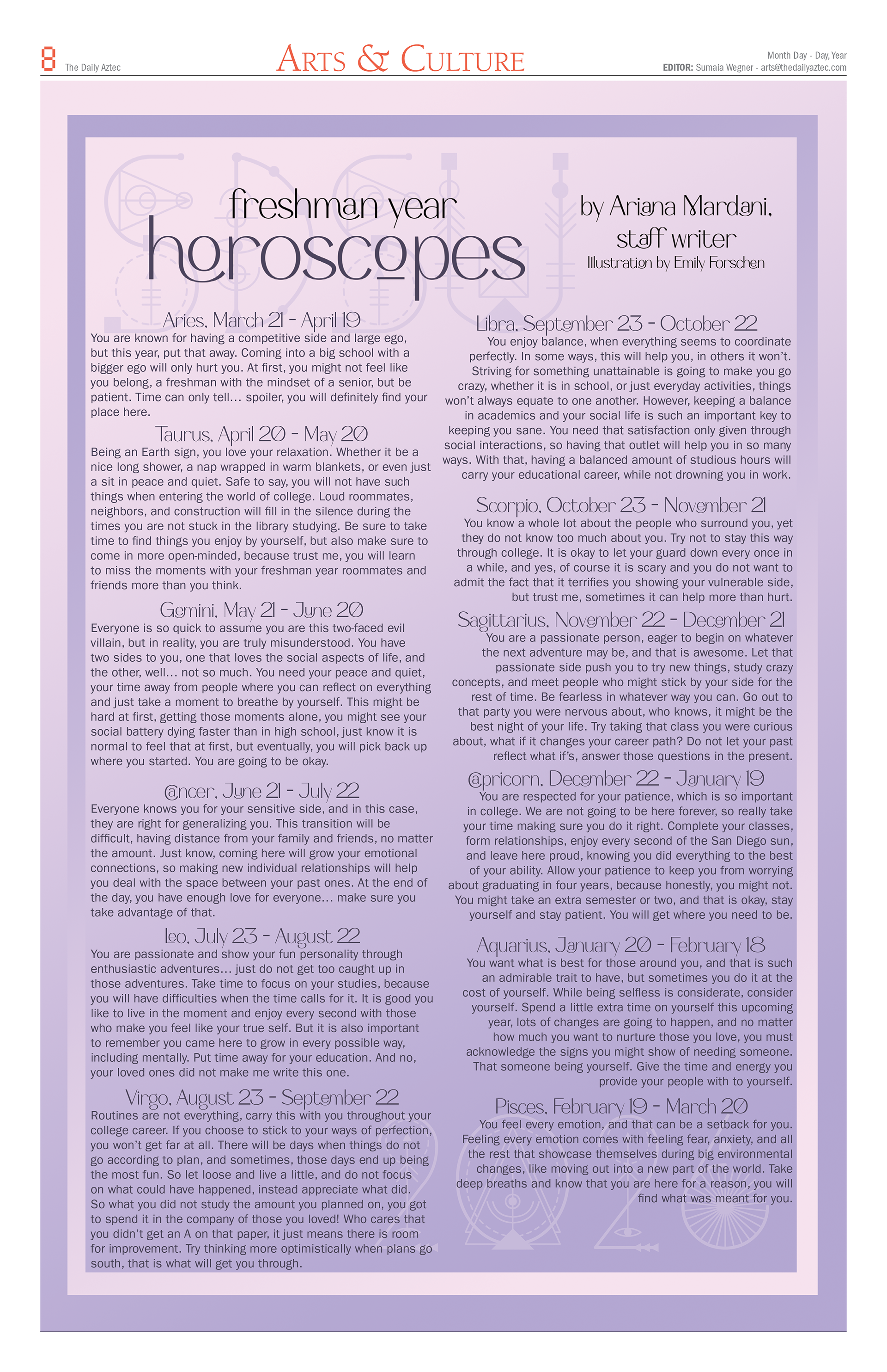
Below are two page layouts that I was tasked with doing remotely that were particularly difficult. The horoscopes were sent to me as is and needed to be laid out on one page in an appealing way. Because they were so text-heavy, it was difficult to incorporate images or icons. I decided to do a visually appealing gradient with a border to break up the space a bit, while incorporating background graphics that were simple and didn't distract from the walls of text.
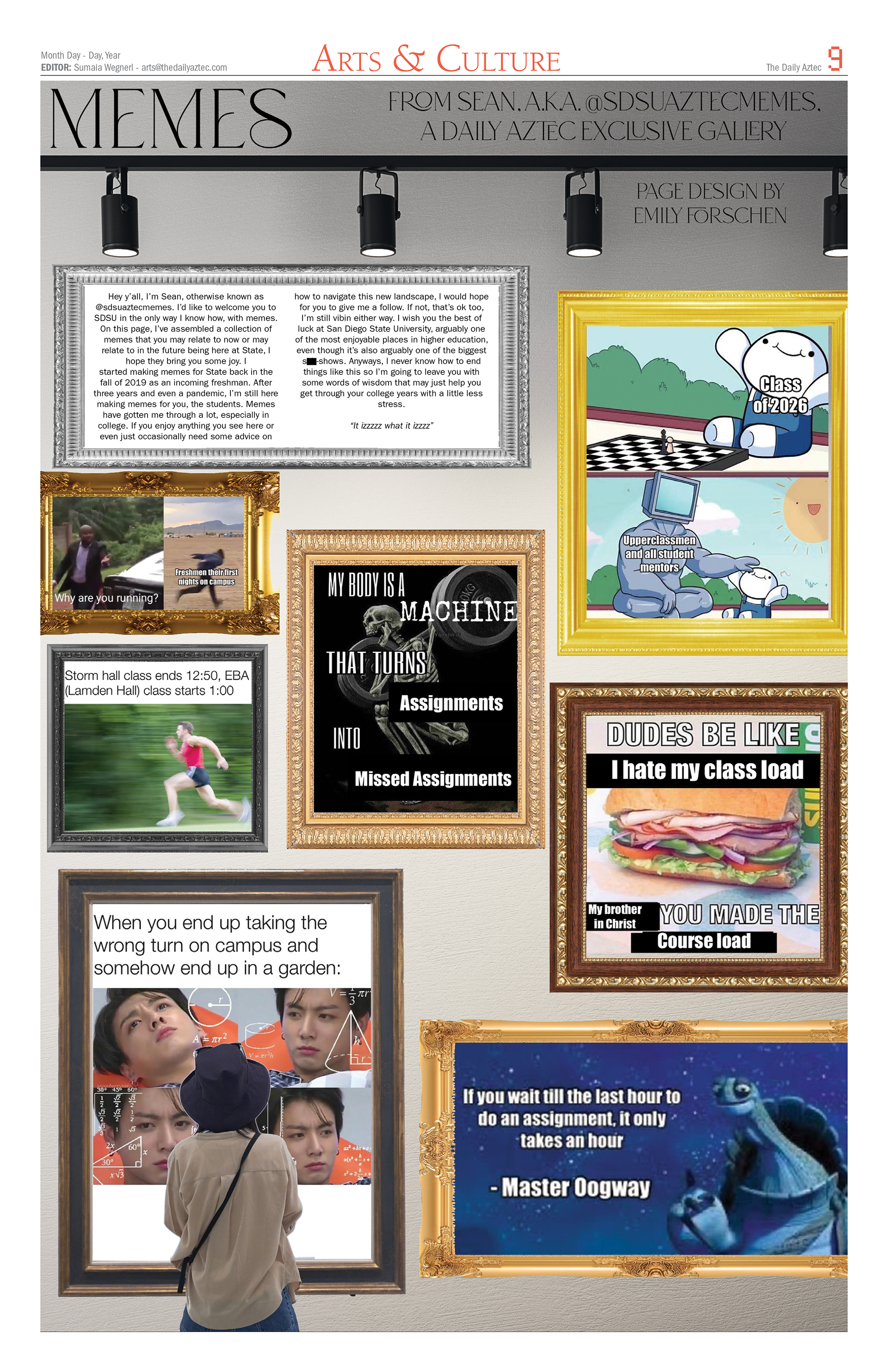
The meme page was the paper's response to the traditional comics page. Since they are all meant to be aimed at Gen Z, we collaborated with a popular campus meme page on Instagram and asked him to make several just for print. Since the nature of memes is that they are chaotic and aesthetically jarring/unpleasing, this made conceptualizing a design very difficult. I decided to poke fun at it, turning the design in on the joke, by adding poorly stretched gilded frames and turning it into an art gallery page that was made for laughs and imitated the chaos and sensory overload of the popular Instagram page.
(Page headers were updated later)


